
Friday, 10 January 2014
Wednesday, 8 January 2014

Thursday, 2 January 2014

Music Magazine Contents page Draft

the contents page will follow the same colour scheme as the front cover.
The title banner will be red, the title itself will be white as well as the little stereo at the end of the banner which is on the next page.

The subscription advert to entice people to subscribe. I found that these appear on most contents pages. This is because most people read the contents so they can go to the page they go to. I have put mine in the right top corner with brief details about the deal.
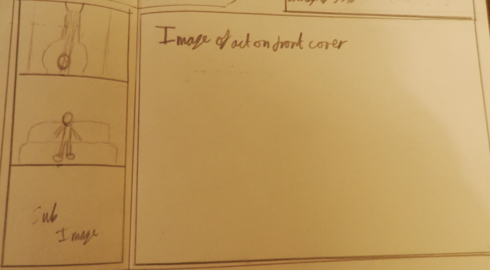
The contents page will have one main image with three sub images to the left. The main image will be of the artist on the front cover.


The usual features are the features that are included every week. They should be popular with most readers who buy every copy.
The bar at the bottom with website and page number. It is the same throughout the entire magazine.

Wednesday, 1 January 2014
Music Magazine Front Cover First Draft

This is the front cover of my music magazine, the colour scheme will be red, gold, silver and white. It contains everything a front cover should contain.
The header has a star followed by the line "top new bands inside - P72 inc. the nationals. The fact that one band has been singled out shows that this band is the favourite new comer of the magazine.

The masthead is a red bar with white writing. The O's are meant to be stereo speakers and the dash has pause, play, eject as well as fast forward and rewind to make it the centre of the stereo.

The pug is going to be gold and reveal that there is an iPad to be won if you buy the magazine.

the barcode section includes the issue number, the date of print and the price of the magazine.

I only have one subsidiary image so as to not take to much attention away from the main image. It is accompanied by a sell line telling the reader who the picture is.

I struggled to find a good main image. In the end i decided that it was to be a person stood against a tree with his guitar near by. The splash is the name of the act that the person in the front cover is from. The pull quote reads "life at the top can be so sweet" this reveals that part of the interview will be about how they are coping with their fame.

There are three sell lines which show some of the major stories or features that people would like to read even if they are not regular readers.
Subscribe to:
Comments (Atom)