
The masthead for my magazine is a blue background with 8 in big yellow roman numerals. This comes the name of the school, King Henry VIII School. The yellow stands out from the blue to make the masthead recognisable and bold.

Although from the picture it may not look like it, but the pug is a circle. A red one which stands out from the white background. In black letters it says "win an ipod". Indicating that there is a competition in side with a worth while prize.

The bar code for the magazine is simple. It contains the date published and the issue numbers as well as the barcode itself. It has a black border and a secondary blue border.

The splash is in yellow because it fits in with the colour scheme of blue,red,yellow and white. The caption underneath is smaller and in black lettering to distinguish it from the splash. They fit in to the right of the mid body section of the boy in the main image.

I chose the main image as it represents someone going to collect their results and that is what the splash is all about, in truth the picture came first and that inspired the splash as that is what I thought of when i saw the image for the first time after i had drawn it.

The sell lines are in boxes with jagged edges to show its up to date and modern. They mostly contain a title or a list with a brief explanation underneath. i might have to change the style of the boxes to squares if i cannot make them work in Adobe InDesign.
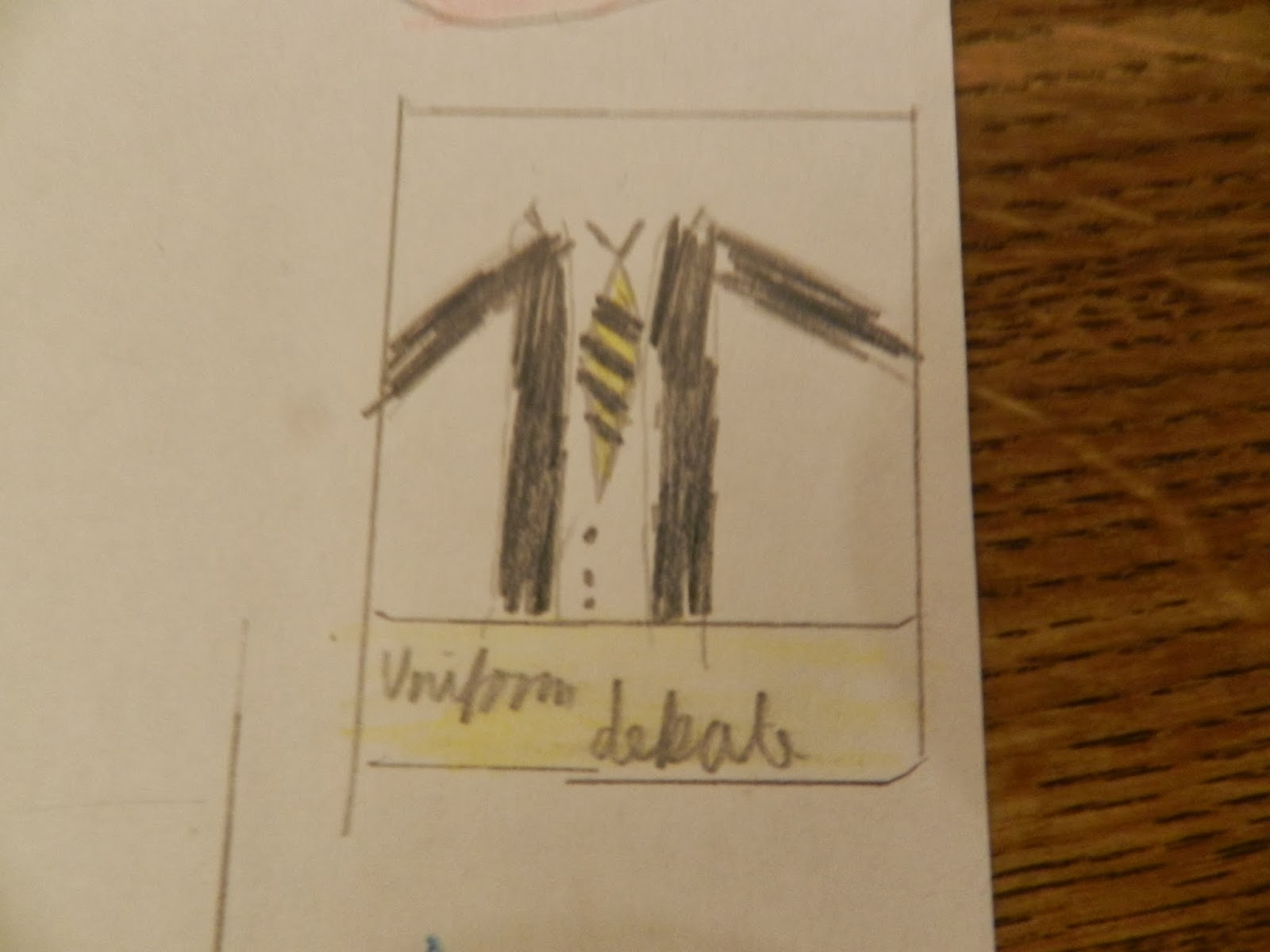
Both the subsidiary images are in a white box with a small rectangular box underneath. I chose this because it goes with the colour scheme and easily fits into the grid layout of the magazines.This one contains a picture of the uniform with the caption uniform debate because it is relevant to magazine as being for school pupils.
No comments:
Post a Comment