How Did You Attract/Address Your Audience?
Friday, 2 May 2014
Thursday, 1 May 2014
Evaluation Question 1
In what ways does your media product use, develop or challenge forms and conventions of real media products?
Wednesday, 30 April 2014
Evaluation Question 7
Looking back at your preliminary task, what do you feel you have learnt in the progression from it to the full product?
Tuesday, 29 April 2014
Evaluation Question 4
Who Would Be the Audience for Your Music Magazine?
 My music magazine audience from the questionnaire I did earlier in the year and the reader profile I made show that the audience for the music magazine is male because 70% of the questioned where male. My music magazine questionnaire also shows that that main reader would be 11-30 year olds but a more precise look would show the main readership to be 16-24 year olds.
  The magazine has been carefully designed around around that audience. Most of the artists and bands in the magazine are male and in the same age group as the readers as i felt that this is what the age group listens to, the new genres and sounds that come from the innovative young new bands. Young people are the people most likely to go to a music festivals and so I have a whole feature on the best of the ones their are in Britain and some from the rest of the world. I even gets a tagline on the front cover.
Young people also want more information about things that they and go and tell their social group that they know this about what happened which is why the G3's have a tagline on the front cover is for the people why want some gossip. This magazine will give them a little of that but it is mainly a serious and informative magazine, it tries to have the right mix.
Technophiles would also make up a large part of my audience, so I have added things like a QR code on the cover and the website at the bottom of each page. So that they can use their phones and computers to enhance their experience.
The audience is mainly students and so the magazine has to be cheap. My magazine costs £1 a week which is very affordable even on minimum wage. If someone does not work they most likely will have a spare pound lying around or someone to borrow a pound off because my audience is usually part of a social group that they hang out with.
Evaluation Question 3
What Kind of Media Institution Might Distribute Your Media Product and Why?
The media institution I would use to distribute my media product is Bauer. Bauer is the largest media institution in Europe and is multi-platform using magazines, TV, radio and mobile platforms.

The first reason for going with Bauer is Frontline. Frontline is a distribution company used by Bauer. It takes the paper copies of the magazine made by Bauer and distributes them around the country to wholesalers. This would mean that the distribution is already taken care of and I know it would make it through to the shops if approved by Bauer. Frontline was an Emap company before it Emap was taken over by Bauer and Frontline became its own company.
Another reason to pick Bauer is because they are cross-platform media company. I believe my magazine would benefit from the recognition given to it by the radio and TV station as well as other magazines like the similar Q. It would also help attract the technophiles from the social group that my magazine targets by having a mobile version to access from your smartphone or tablet. Bauer own many radio station and my magazine could benefit from a radio station and they could advertise each other in a sort of symbiotic relationship.
If their is any negatives to using Bauer it would be that my magazine might be a little to similar to another one of their music magazines. Their best seller Q. Bauer would be unlikely to take onboard a music magazine that could take away sales from Q. Unless it proved to be a better seller before they brought it. Another way would be if it brought in a different audience because they would mind a little shift in the reader ship because they would still get profit no matter which of them sells better because they would own them both.
Evaluation Question 2
How does the media product represent a particular social group.
My magazine is aimed at 16 to 24 year olds. Much like Q which is what my music magazine has been based on. Also like Q and many other music magazines my target audience are mainly male with 70% of would be readers being male. My magazine is a cheap weekly magazine so students and less well off people can enjoy the weekly updates of the music industry

The colour scheme is similar to some special editions of Q because it gives the magazines a premium feel. This could help it attract more people that are outside of the 16-24 males as it is supposed to attract everybody.

The tagline about "GLASTONBURY" represents the young people the magazine is aimed at because festivals are mostly attended by the the younger people. The G3's talking about a split is also geared towards younger because they are more likely to want the hot new news that they can tell their friends about. Another way this front cover represents my target social group is the QR code on it. This is because most young people are technophiles, so the chance to use their smartphones would be very appealing to them. The image is a stare with attitude which reflects the style of music the cover act is known for but the music is most popular with the age group it is representing, the rebellious laid back late teens early twenties.


The contents represents the social group targeted by my music magazine because the images show people of the age group that the magazine is representing. The font used is also used to bring in interest from the social group as it is bold and not boringly simple. It uses the same colour scheme as the front cover. The social group this product is aimed at contains technophiles so the inclusion of the website at the bottom of the page represents them and the synergy we create to attract them.


The social group is represented in the article because the language used in it is casual but informative, it lets the casual reader get the information they want about their favourite bands with out having to read through lots of writing with complicated wording. The bite-size facts also help to do this. The page can be described as a bit minimalistic but it works well and the point of the article gets across and the style of the pages are the same for the front cover and contents page
Monday, 28 April 2014


Monday, 14 April 2014


Wednesday, 26 February 2014
Music Magazine Front Cover Version 4

Music Magazine Front Cover Version 3

Music Magazine Front Cover Version 2


Friday, 10 January 2014

Wednesday, 8 January 2014

Thursday, 2 January 2014

Music Magazine Contents page Draft

the contents page will follow the same colour scheme as the front cover.
The title banner will be red, the title itself will be white as well as the little stereo at the end of the banner which is on the next page.

The subscription advert to entice people to subscribe. I found that these appear on most contents pages. This is because most people read the contents so they can go to the page they go to. I have put mine in the right top corner with brief details about the deal.
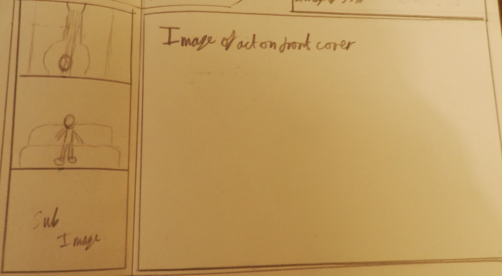
The contents page will have one main image with three sub images to the left. The main image will be of the artist on the front cover.


The usual features are the features that are included every week. They should be popular with most readers who buy every copy.
The bar at the bottom with website and page number. It is the same throughout the entire magazine.

Wednesday, 1 January 2014
Music Magazine Front Cover First Draft

This is the front cover of my music magazine, the colour scheme will be red, gold, silver and white. It contains everything a front cover should contain.
The header has a star followed by the line "top new bands inside - P72 inc. the nationals. The fact that one band has been singled out shows that this band is the favourite new comer of the magazine.

The masthead is a red bar with white writing. The O's are meant to be stereo speakers and the dash has pause, play, eject as well as fast forward and rewind to make it the centre of the stereo.

The pug is going to be gold and reveal that there is an iPad to be won if you buy the magazine.

the barcode section includes the issue number, the date of print and the price of the magazine.

I only have one subsidiary image so as to not take to much attention away from the main image. It is accompanied by a sell line telling the reader who the picture is.

I struggled to find a good main image. In the end i decided that it was to be a person stood against a tree with his guitar near by. The splash is the name of the act that the person in the front cover is from. The pull quote reads "life at the top can be so sweet" this reveals that part of the interview will be about how they are coping with their fame.

There are three sell lines which show some of the major stories or features that people would like to read even if they are not regular readers.
Subscribe to:
Comments (Atom)