Tuesday, 24 December 2013
Thursday, 19 December 2013

Sunday, 24 November 2013
Q audience research

15-24 = 35.5%
25-34 = 26.3%
35-44 = 19.8%
45-54 = 13.9%
55-64 = 3.1%
64+ = 1.4%
The target I want for my magazine is about 20-30 years old, looking at Qs readers ages I can see that Q has a similar target audience.
Qs main audience is 15-24 which has more than a third of their readership followed by 25-34 with just over a quarter of their readership. The amount of readers drops off dramatically after 55 with only 4.5% readers over that age.
My target audience that I'm looking at which is 20-30 fits in Qs 61.8% between 15 and 34 years old because Qs survey starts at 15.
I am looking to design my magazine to focus on a male target audience, the majority of Q readers are male which is also similar to mine. The gender percentages are:
male = 68.3%
female = 31.7%
I'm looking more towards a 75% male to 25% female readership depending on primary audience research results. Q defiantly appeals more to men just like the magazine I am planning on doing. My magazine would be good if it was heavily Q inspired looking at their audience.
Wednesday, 6 November 2013
What i have learned from my research
From the research i conducted I have found a few things that most of the magazines have in common and this is what I found.
The masthead is the main source of brand identity, It gets a prominent position on that front cover and features on all the pages in the magazine.
Colour scheme is a big part of brand identity, it is the colour on the front cover and usually on the contents page however does not affect the aesthetics on the pages inside of the magazine. They are usually different colours to the colours associated with the brand.
All front covers utilise a grid method for sell lines on the front cover. There are usually about five sell lines on a front cover.
The main feature to a front cover is the main image. Emphasis is put on it and everything else is placed on the outside so as not to interfere with the image. The image has to be interesting to grab the attention of passers by.
The contents page should contain images and the brand colour scheme. They are broke up into sections. The advertisement for subscription usually on it. There is usually a small sample article so the reader knows what he's in for. The contents page can be one or two pages.
The style of the articles are simple. You want it to look good but you don't want to take to much attention away from the article its self. The article sometimes isn't very long, but the pages are padded out with images. The website usually features somewhere on the page
At the bottom of the pages should at least be the page number but the masthead sometimes feature and the website.
The image colour for an article should reflect something about the artist. e.g. the red and blue for Jay Z symbolises two sides to his personality and the black and white images for My Chemical Romance reflects the dark nature of their songs.
Quotes are important in an article. They show what the band is like when talking to the journalist for the magazine. Pull quotes are important as they give an insight to what the article will contain. They are usually the most important thing the artist says in the article.
KERRANG Article Analisis

In the top left in a black is the word NEWS. Showing that this is the latest news from the band that was available to the magazine. World exclusive gives the sense the KERRANG are well respected in the music industry. On the far right there is an insight into some of the new tracks that could possibly be some of the first information on them that isn't just speculation. Beside that to the left is is the article its self neatly arranged into two columns. Above the article is the the title which is a quote from the band in huge letters and stands out from the background to grab the attention of a reader who is just flicking through. Under the quote there is a sub title reader "my chemical romance invite KERRANG to their recording studio". Implying that they have special privileges over its rivals.
The content is all about the new album as it describes it 'will have several themes". It compares the style of the album to other that the band have made. It includes quotes from the band relevant to the upcoming album. The language used is civilised, its not tying to connect totally with the fans because the fans will just want the news.
The article is vary image heavy. All the images are in black and white. The main is the main singer in the recording studio. There are three smaller images of the band recording, one is the guitarist playing guitar another is the band discussing something (possibly a song) and the last image is the singer recording vocals. All the images fit into the article that the journalist went to the recording studio.
The colour scheme is similar to what is on the front cover but without yellow and more emphasis on black, possibly in reference to the bands "emo" stereotype and dark songs.
NME Article Analysis

The layout of this double page spread has three main sections. The left page is devoted almost entirely to an image of the band being talked about in the article. In the top left corner is the name of the feature "RADAR" and in the bottom left is some small, relatively useless facts. In the left side of the right page is the article in question withe the title "NME LOVES THE TEENAGERS" with the sub title of "Young, dumb and full of... filthy tunes". On the far right is a section unrelated to the main article, its a bite size round up of the weeks most talked about acts.
With the title starting "NME LOVES" its a more biased look at the band than might be the case normally. The pull quote is from one member of of the band explaining that they are stereotypical teenagers.
At the end of the article there is a reminder about their website that they what you to visit as it is another platform they produce on.
The colour scheme on his page is blue and black, which differs from the colour scheme of the brand, they have a separate colour scheme from this feature so your get an attractive array colours when you flick through the pages.
Q article analysis

The double page spread of the article is laid out with an image of the rapper Jay Z which the article is about. It also contains a pull quote from the article on the right. On the right we have the main article with the title THE MOST EXCITING PEOPLE IN MUSIC JAY Z in red. There are three main visible parts to the article, with the second and third starting with the bold letter H and T.
The image on the left is a medium close up of the artist with red on the left and a cooler blue colour on the right. The red suggests danger, he is a rapper and so his style of music is associated with rebels and violence. The blue on the right could be suggesting that the article reveals a lighter side to his personality. There is is pull quote in bold red on the blue side to draw attention to it, it reads "EVERYONE TRYING TO DO SOMETHING NEW IS GOING TO COME UP AGAIST A NOEL GALLAGHER FIGURE IN THEIR LIFE". This is a notable quote from their interview, it could be showing Jay Z's respect for Noel Gallagher and his music.
On the right side we find the article its self, it features a big red J. This is because it is the first letter of the artist name. The big letter is brand unique to Q who do it often. At the vary the of the page there is a title in between some lines to pronounce it. At the vary bottom of the page is the logo/masthead with the page number next to the so people can get to the article straight from the contents page. Next to that is the month the issue came out and on the other side of the page is the website to encourage people to use the other platforms Q produce for.
The content is aimed towards Jay Z fans as it focuses on quotes from their interview with him and does not shy away from using profanity so is not intended to the read by younger readers. The language used is not at all times proper english as it tries to tailor the article for his usual listeners.
The main colour scheme is black and red, which are the colours you would identify with the brand. however there is added blue in the image for the two sides to a person cliche.
Tuesday, 5 November 2013
Kerrang Contents Page Analysis

The colour scheme of the contents page, like all other magazines I have analysed is the same that you will find on the front cover. This is because of brand identity. The contents have two distinct sections. the sections are the top half and bottom half and not the usual left and right. The top section contains the title Content with the issue and date. It also contains the main image with corresponds with the main article, small white banner to tell you the artist. Inset is images of two articles to give a sample of what you could expect to find when when you go to read an article. The bottom section is split into columns and has the title KERRANG THIS WEEK in the style of the logo for familiarity. The column to the far left is a message from the deputy editor to give the reader an insight into what goes on behind the scenes at KERRANG. In the other columns the other main contents are placed under appropriate titles for ease of use. In the bottom right corner there is an advertisement for subscriptions to magazine and contrasts to the background to bring attention to it. This almost ensures that everybody who reads the issue sees the advert before skipping to the article they want to read.
Q Contents Page Analysis

The contents page keeps the same colour scheme as the front cover because it fits in with the identity of the brand. The contents cover two pages and is image heavy. Images are used to display some contents as a visual stimulisation to check that artical out. There are four main sections (two each page) with a red bar at the top for the title and issue number. The first section is called features, it contains all main features of the issue, the most important eye catching articles. At the bottom of the section we see what one of the article would look like along with the page number. This show the reader the style in which the articles are produced. The second section is just a picture representing the main article. In this one we have a long shot of John Lennon. The third section is on the second page. It contains two pictures of artists. Two pictures of articles all with page numbers, there is no name to these pages but if you recognise the artist then you will be convinced go to that article. Underneath the images there is a large pull quote from a review they have on the stated page with an image to go along with it. The fourth section is on the far right. At the top we find images of the different covers for the issue ( this issue was a special issue with four covers so this could be suggesting readers "collect them all" which would increase their sales for the issue ) underneath we have the regular. These are the features that are in all off the issues, tis allows people to quickly find their favourite features. In this contents page it does not advertise subscriptions but instead gives you a page number. This is good for Q because it does not waste space on the content pages so they can get the aesthetics to comply fully to their ideals.
NME Contents Page Analysis

The contents page of NME uses the same colour scheme in its contents page that it has on its front cover. This associates these colours (red, white, black and yellow) with there brand. The page is set into three columns with a black bar at the top for the title. The column to the left is an index of all the bands that are in this issue of NME, this allows a person to find and go to the page with there favorite band quickly as well as showing the the reader how many bands they managed to get into their magazine possibley as a sense of pride. The middle column contains a little artical for the reader to sample before fully jumping in to the rest of the magazine. Below that is an advert for a subscription which is put there to be noticed as it might be missed by anyone who just skips to what they want read instead of reading the entire magazine. The third column shows all the main features, it is a sample of what the magazine offers and the pages most likey to be read by NME usual demographic. The main artical is placed inside a large red arrow to stand out from the rest..The contents page contains three picture, two for the little artical, they show an performing on stage and that is what the artical talks about so you get more of a sense of what happened. The third picture is that of a previous front cover to go with the subscription advert
Monday, 4 November 2013
Thursday, 24 October 2013
School Magazine Front Cover Final Draft

Monday, 7 October 2013
break down analysis of school magazine front cover

The masthead for my magazine is a blue background with 8 in big yellow roman numerals. This comes the name of the school, King Henry VIII School. The yellow stands out from the blue to make the masthead recognisable and bold.

Although from the picture it may not look like it, but the pug is a circle. A red one which stands out from the white background. In black letters it says "win an ipod". Indicating that there is a competition in side with a worth while prize.

The bar code for the magazine is simple. It contains the date published and the issue numbers as well as the barcode itself. It has a black border and a secondary blue border.

The splash is in yellow because it fits in with the colour scheme of blue,red,yellow and white. The caption underneath is smaller and in black lettering to distinguish it from the splash. They fit in to the right of the mid body section of the boy in the main image.

I chose the main image as it represents someone going to collect their results and that is what the splash is all about, in truth the picture came first and that inspired the splash as that is what I thought of when i saw the image for the first time after i had drawn it.

The sell lines are in boxes with jagged edges to show its up to date and modern. They mostly contain a title or a list with a brief explanation underneath. i might have to change the style of the boxes to squares if i cannot make them work in Adobe InDesign.
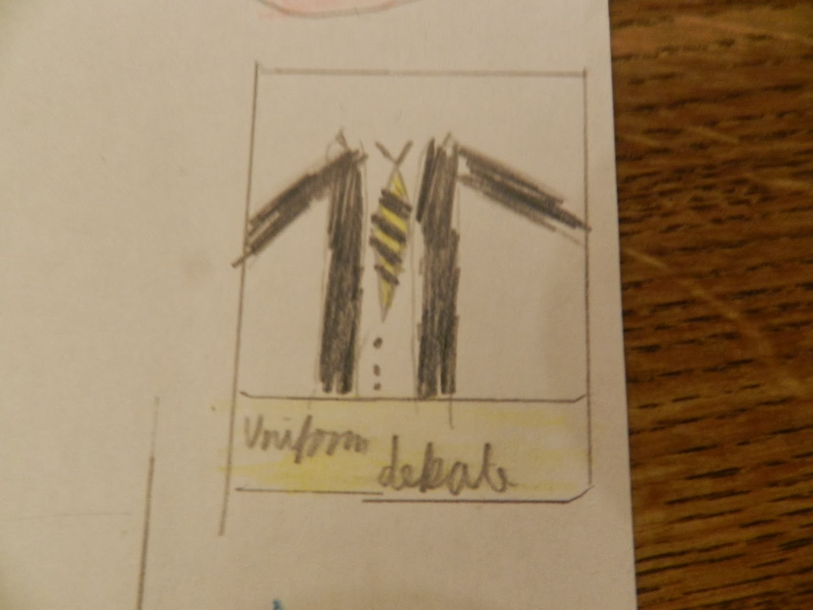
Both the subsidiary images are in a white box with a small rectangular box underneath. I chose this because it goes with the colour scheme and easily fits into the grid layout of the magazines.This one contains a picture of the uniform with the caption uniform debate because it is relevant to magazine as being for school pupils.
Sunday, 29 September 2013
First Drafts of School Magazine Cover


These are the first two rough drafts of the cover of the school magazine. They are very rough drafts and the photos aren't that good either but they give a good idea of where I want to go with it. I will will be going mainly with the first one. (the one with roman numerals as the mast head.)
Subscribe to:
Comments (Atom)